Website Design and Creation
I create custom-designed, cleanly coded sites that are well-written with organic search results in mind.
I can also set you up with a user-updatable shopping cart and secure, PCI-compliant hosting at a great price.
Creating a great site takes a solid idea, top quality writing, uncluttered graphic design, organization, and clear navigation. I work with my clients to solidify the idea, focus and message. I focus on the look (the design and the user interface), organization, navigation, and content. If I'm writing your content for you, or if you wish me to work with your words, I optimize your site's wording to best tell your story and get you found. (Wording is one component of “SEO.” Everything I recommend that I do for you plays a role.)
At times I bring in associates to put an extra polish on the design. When more than basic programming is called for, I turn to, and work with, great people I respect fully.
If you'd like help with social media, I can help you, too.
The important thing is that you, as my client, get what you need or seek. I'll always let you know what I can do for you. I don't take on a job unless sure I can do you justice.
My web design history
When I dove into web design I didn't just learn a bit of HTML and build one of those long pages full of anchors. No, not Deb. I started with pages and sites. Early on, I learned WebSTAR (web server software) and with help from the amazing Eric Bickford, loved using his WebFM as my CGI to have web pages communicate with FileMaker Pro databases to feed the database, create pages and serve them to the browser.
As I learned, I documented, writing a book for then-new Claris Press. However, the timing was not right with FileMaker and the book did not come to be. Some of my work on this was published in Net Professional magazine. I also helped write the WebFM manual. I also learned another CGI, called Tango, and helped teach and develop Tango classes for that company.
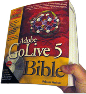 As part of that book process, I looked at each of the WYSIWIG web page editors. Once I saw the preview of the first version of GoLive CyberStudio, I fell for it. A couple of years later, when IDG Books came to me asking me to write about GoLive came up I jumped on it. The result was the Adobe GoLive Bible. Adobe and IDG killed the v4 book due to the many inaccuracies of the co-author they forced on me. (They incorrectly assumed that I couldn't write for Windows.) Then, finally, I was able to release the Adobe GoLive 5 Bible which was (is) 1100+ pages on not just the how, but the what and why of site creation using GoLive. That book earned me the nickname, The Xena of GoLive.
In January 2001, Mac Design magazine was born and I became its GoLive columnist. I wrote the how-to column there, the tips, and the Q&A as well as new version reviews. I also wrote about web design using GoLive for another major design magazine. Later, I wrote about GoLive for Macworld magazine as well.
Adobe has since dropped GoLive in favor of Dreamweaver, which they acquired. Fortunately, after Adobe had Dreamweaver for a while, it progressed to the point where I enjoy using it. I love its CSS features and the CS5 layout features. Throughout 2009 and 2010, I converted old sites and created new one in Dreamweaver. In 2010 I started writing a bit about Dreamweaver. I have also written about some of the other great web authoring tools out there, helping Macworld readers know their options. (Search for Deborah Shadovitz at Macworld.com and you'll find those Macworld reviews.) I started seriously using WordPress in 2011 as I traveled without a Mac.
Some of my websites
Most of my web work is behind the scenes as I teach/help others. Here are some of the sites I can show.
- LAElderLaw.com
This website, for the Law Offices of Joseph C. Girard, LA Elder Law, is a full job from writing about Elder Law to explaining what the LA Elder Law team can do for Californians, to the customization of a WordPress theme in order to provide these fabulous Elder Law lawyers with a site that truly reflects their caring, diligence and effectiveness. It has been quite a while since I have wanted to embark on such a detailed and all-encompassing project. Once I knew these great people, I was excited to help let the world know about them. This site went live in Oct 2015. It was created in full as I traveled.
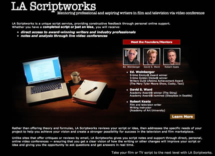 LA Scriptworks
When famed TV author Ed. Weinberger and his friends turned from their first web designer, they came to me with a layout a large design area but tiny space for text. They were not happy with that design, which turned out to be a template that previous, rather costly company had purchased.
I went in another direction brining in designer Mario Salinas for collaboration. We gave them imagery that suited their business as well as ample room for text. Ed, Robert, Mario and I also had some fun as we shot the home page image, so I snuck it into the secondary pages, providing a good treat for those who explored the website.
I was really proud to be a part of this project. This site is down now though, as they decided to discountiue public offering of their services.
- M
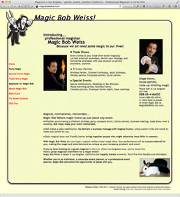 agic Bob Weiss
Magic Bob's website was created from scratch in GoLive 5. Bob provided the images of himself and some of the photos used within. The design and words are mine, as the result of discussions with Bob. This site was done partly as a series of GoLive experiments. The "fun" page was a big hit with children and Bob's students. The elements on that page were not common at the time. Those elements are DHTLM, dynamic HTML, rather than done with animation software.
 I'd actually created an updated design that awaited uploading for years because Bob didn't want to switch. The original site, had brought Bob the majority of his business ever since it went up around 1999 and until his semi-retirement around 2010 remained in the top three sites for his relevant search.
 - David Streets Beverly Hills
When I met David his contained images of text, not actual text, so it wasn't being found. The first key was to code a new site, using CSS and PHP includes for flexibility. At his request, It was demaned that I keep his background black and text white, despite my solid recommendation not to do use that combinaton. So, I changed his font for better readability and adjusted the "white" to be less shocking. In order to show off more artwork, I added slideshows that were Flash, but provide image versions for iPhones and other Flash-less devices. The result was a flexible, easily updatable site that is found via search and brings in business. However, this business has since closed.
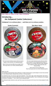
- Specialty Cookie Site
Simple scenario: new business tight on funds needs a site to get started. The solution was to pop the already-design graphics into Photoshop to create a web design, and to keep the site's structure very basic. After that, it was all about the wording. I have removed the link because, sadly, the cookie creator has passed on.
- MacGathering.com is my own event website with online registration. I have tried several registration systems over the years. The most recent one was created by Peggy O'Connor.
- MacDayLA.com one of my own event sites.
- Single Mariners of Marina del Rey
While I did was active in this sailing group, I was able to get control of the domain back from a gone-missing former member back to the group's founder. I then created a helpful website that got the message out. I also created two business card-sized info cards for group members to hang out. I even put signs up around the marina. With my efforts, membership boomed and the group reached an all-time attendence high.
After a few years, I left the group, turning the website over to them, and they made some changes that aren't up to my standard. (After that, the new leadership lost the URL so there's an entirely new URL and website.) So, here, opening in a new tab, is the site as it was the day I resigned. I have removed the name of the group though, so as not to confuse people who might find it.
I created this in GL 8. All the photos of the "skin" are by me. Some of the older photos on the photos pages were taken by other members.
By the way, here is the alternate business card I created for the group. (Just close the window that it opens in when you are done viewing it.)
- The site of a financial expert
The challenge: what do you do for the personal site of a financial specialist? A site full of dollar sign images doesn't fit Matt. Instead, I used the text as the design with a simple graph paper background, which seemed befitting. As he no longer needs the site, it's offline for a while.
 At the time this site was created, it was not common to use text as design. That is, text has long been used as a design element — but on the web that text was typically saved as an image and displayed as a graphic. In this case, the text was always text and I used CSS to give it creative spacing. As it was the somewhat early days of the web, though, I did provide image version of this text. Browser detection took those on older browsers to the alternate page so the site still looked the same for those folks. The graph paper background was the work of designer Mark Jaress. Mark created it for me to share with readers on my GoLive 5 Bible's CD.
- Paradise Villas — assisted home care senior residence
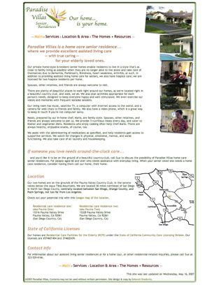
The original site had no text and did not come up appropriately in searches. Editing graphics provided to me and adding some of my own, I placed them into a pure CSS framework. Of course, I wrote text for the site as well so it could be found on the web, now commonly called SEO, but to me it has always simply been being helpful. I also created the map shown on the home page and added much-needed information. However, the family that ran the villas has since closed them.
 San Gabriel Macintosh User Group (2004-2007)
This site was created by me from scratch except for the gift of the "frame" that friend Scott Immerman "loaned" to me. I penned and maintained it from 2004-2007. This design was eventually replaced by a blog.
- Divorce: the musical
I had one day to get this site up and for material was given a graphic of the film's "onesheet." I quickly turned it into a PDF, cropped it in Photoshop, sliced it up, and popped it into GoLive. It is not a site I would typically build, but it was right for this client.  Digital Media Marketing Organization
The agreement on this site was that I'd create it using whatever graphics the organization supplied to me. I took their tiff or psd files and worked them into this website design. In come cases, I worked with less-er quality graphics and made them move website-friendly.
The basic words were provided and I worked on them from there, so the text was a combination of theirs and mine.
The client very much wanted a black background so I softened the contrast by using a light gray text rather than white. I don't recommend red text on black but we went with that for a while.
This site also contained forms and a connection to Paypal for membership payment.
The organization has since closed.
- Full Fashions For Less
(Now offline, proprietor deceased)

- GoLiveBible.com — now at Shadovitz.com/golivebible
The official website for my book!
[This site was designed in 1999. It's very old but I kept the domain for posterity, until 2015.] This was the official website for my book, the Adobe GoLive 5 Bible. The design here is a team effort. I started it and Mario Salinas made it interesting and polished it. As there was never another version of this book due to changes in direction by the publisher and by Adobe, and now there is no more GoLive, I have not added to the site. - WebGrrls-LA
This was one of my first sites, 1996-1997 sites and it was amazingly ground-breaking!
It was an amazing database-driven site where members could create a record for themselves and list their work availability, listing sites they created as an online portfolio. (You'd think nothing of that service now, butit was ground-breaking and amazing back in 1996 and 1997!) For the design I'd used HomePage.
The data, whether resume info or a search, was entered into an HTML form, transferred to FileMaker Pro 2 or 3. Women entered their resumes and job availability. Where it was stored in various fields and upon search, returned to a visitor as HTML. To communicate with FileMaker Pro 2, then 3, the data went via a then-ground-breaking CGI called WebFM by Eric Bickford. Within FileMaker, the HTML was created by concatenating multiple text fields with hard text — all as formulas.
I took it down, as I was among the many original members who put so much into it but were soon unhappy with the way the organization was run. Unfortuantely I lost the home page from that site, because I'd love to still have its functionality.
How to contact me for web design
If you'd like to consider having me create or recreate your website, please send me an email. Please let me know what you have in mind, what your resources are, and what you timeframe is. Be sure to provide a URL if the site already exists. And don't forget to provide your contact information.
Are you wondering if location is an issue? I am based in Los Angeles. Most of the people I work with are in the Los Angeles as well. However, it' just as easy to work with you long distance as it is if you're right here in Los Angeles. Between phone, iChat/AIM and email for communication, and either iChat or Skype for screen sharing, we have everything we need to communicate effectively and efficiently. And, of course, I stage the site online so you can view and test the site as it is developed.
